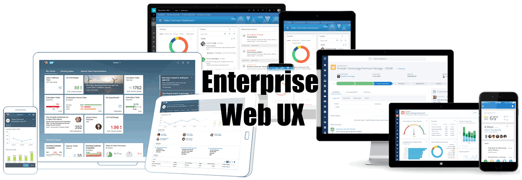
A so-called design system consists of a styleguide (design guidelines) and a collection of components as building blocks for a user interface. A well defined design system allows different development teams to build independent applications and services with a consistent look&feel and user experience. This is particularly important for business software, that mostly consist of numerous apps, modules or services. With a good design system, a user will feel at home in any part of the system.
Another important benefit comes into play, where large number of complex business objects need to be managed. Designing an understandable and efficient UI in this case is quite a challange. Design systems standardise tools and approaches, giving developers and users battle-tested instruments for typical tasks like searching, displaying, editing and performing actions upon complex objects like orders, customers, kampaigns, etc.
All these openly available styleguides are greate sources of inspiration for every UX designer. I do recommend taking a closer look at every one of them even if you are not anyhow connected to the corresponding vendor or it's products.
SAP Fiori and OpenUI5
Back in 2013 SAP was the first of the software giants to publish their design guidelines for web apps. The new web UI was named SAP Fiori and the corresponding Javascript framework was opensourced as OpenUI5. Since then, the framework and the design guide are being actively developed.
The current Fiori Design Guidelines 2.0 are really worth reading! They focus exclusively on business apps and includes not only controls, but entire page layouts (floorplans) for typical UI elements like tabular searchers, editors, master-detail displays, drill-down reports, etc. There are also guidelines for charts, indicators and other analytic elements. One of the highlights, certainly is the Object Page with it's floating header and well designed responsive behavior. But there are, of course many other inspiring ideas, like the Filter Bar for tables and lists, which shows a condensed, but interactive summary of the current search context. Another example is the wizard control - the best responsive stepper I've see so far.
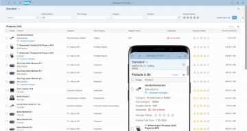
SAP UI5 List Page (searcher)
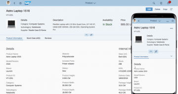
SAP UI5 Object Page
The Fiori guidelines pay a lot of attention to responsive design. They include detailed instruction on how floorplans and controls should behave on different screen sizes. The entire styleguide follows the mobile-first principle, which promotes simple apps with focused views, not overloaded with data and controls. This results in great mobile UIs, but makes it hard to design large desktop apps, that require a lot of data in a single view (wide tables, dashboards).
Fiori's main idea is, that a large software (like an ERP) should be split into numerous (possibly hundreds!) of small Fiori apps, tailored for specific business processes and user roles. These apps would be all managed by a central "launchpad" application, which takes care of navigation, access permissions, user customizing, etc.
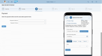
SAP UI5 responsive wizzard
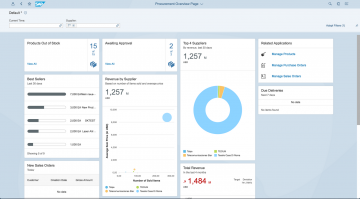
SAP UI5 dashboard
The UI framework for building Fiori web apps is called OpenUI5 (or SAPUI5 in the case of it's commercial version, built into SAP NetWeaver). While OpenUI5 is open source and theoretically usable for any project, it is still quite SAP specific. Many of the cooler features require data in the rare oData format - mostly even enriched with SAP extensions. If your data does not come from SAP, there will be a lot of manual coding necessary. So while UI5 is pretty much your only choice for SAP-related projects, it is probably overcomplicated for non-SAP use cases.
Technically, OpenUI5 is a full-stack web app framework based on jQuery. It strictly follows the model-view-controller (MVC) architecture. UI5 is made to build single-page-applications (SPA) - ideally smaller ones with no more than 10 screens. The framework contains everything you may need: widgets, data models and binding, routing, caching and even testing framework adapters. It is quite different, than the other web frameworks though: views can be defined in XML (recommended) or Javascript. HTML is supposed to be possible too, but limited. Extensibility is unusually limited: There are very few possibilities to use third-party libraries. Even jQuery plugins can only be used in JS-views without having to write special wrappers.
At the bottom line, OpenUI5 is a world of it's own. If you use it, you must adhere to it's rules and learn it deeply to achieve good results. On the other hand, the framework offers everything you need for a business app right out the box, the resulting apps do look really good and the responsiveness works great!
Pros:
- Great style guide for business web apps
- Best responsive behavior among the frameworks in this article
- Full-stack-framework with everything you need to build SPAs
Cons:
- OpenUI5 is complex (especially for non-SAP use cases)
- Poor compatibility to third party libraries (e.g. jQuery plugins) out of the box
- No charts in OpenUI5, only in SAPUI5
Microsoft Design Language and Office Fabric UI
Microsoft has changed the visual appearance of it's products multiple times over the past years. The Microsoft Design Language (MDL) slowly evolved from the flat and colorful Metro UI (MDL 1.0) towards the newest Fluent Design (MDL 2.0) based on the key concepts Light, Depth, Motion, Material, and Scale. The Microsoft Design Language focuses primarily on native windows apps, of course. However, with the latest shift to cloud-based services (e.g. Office 365), it was concequently applied to web apps too.
Similarly to Google's Material Design, the current Fluent Design System describes basic principles of UWP (Unified Windows Plattform) apps in general - regardless of their subject. It defines a generic set of controls like form elements, tabs, lists, etc., as well as the base concepts of navigation, presentation, responsive design, and so on. The included screen layouts are also generic: all illustrations are schematic, which makes them far more abstract, than those of Material Design or SAP Fiori. Unfortunately, there are no business-like examples (e.g. Dashboards, or bigger tables), so you will need some creativity to apply these guidelines to enterprise applications.
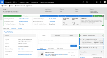
Microsoft Dynamics CRM object page
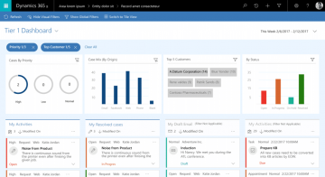
Microsoft Dynamics CRM dashboard
At the same time, Microsoft has put a lot of effort into a unified UI for all it's business software and cloud-services like Sharepoint, CRM and other Dynamics products. This new UI is something inbetween Metro and Fluent Design and has become quite recognizable, although it did not get an separate brand name. While the official MDL does not say much about business UIs, there is a very interesting UX-guide for Microsoft Dynamics CRM. It contains usefull tips for business process oriented UI design as well as some nice ideas for reusable elements like quick-view and quick-create forms. Although, it dates back to 2015, the described principles are still perfectly valid.
Microsoft has also released an open-source Javascript framework for this Office-UI. It is called Office UI Fabric and is said to be used by Microsoft in it's cloud products. Again, it looks different from the above and is by far not that rich as the web UI of the CRM. At it's core, it is a CSS framework, but there are also some Javascript widgets - not very many though (e.g. only a basic data table, no charts, hierarchical tables, etc.). For some reason, this Javascript part of the framework was completely redesigned multiple times. In fact, there seem to be two or three parallel versions of it: one built with vanilla JS (seems almost abandoned), the current official version built with React and a community-driven version for Angular. There is not much documentation and not even a single real-world demo app (all I've found was an example app on medium.com). Perhaps, more reliable alternatives are are Metro and Fluent themes for other frameworks like Bootstrap or Oracle JET.
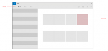
Fluent Design layout example
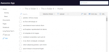
Office UI Fabric example app
Pros:
- Office-like UI familiar to most users
- Official UX-guide for Microsoft Dynamics CRM
Cons:
- No continuous styleguide for business apps (a bit of Metro, a bit of Fluent and a PDF to apply all this to the CRM)
- Comparatively small UI library
- Multiple parallel versions of Office UI Fabric with different development aktivity
Salesforce Lighting Design System
The Salesforce UI styleguide is called Lighting Design System (short SLDS). Just as the Fiori guidelines, it has a heavy focus on business apps, but it is much less concerned about mobile UIs. Although, there are notes on responsive behavior here and there, it is definitely desktop-first.
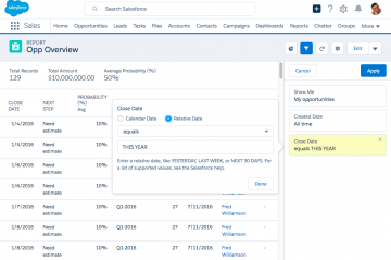
SLDS data table with filters
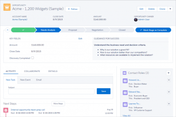
SLDS object page
SLDS includes a huge variaty of different components along with design guidelines, telling you, how to put them together. These guidelines also contain various page layouts: master-detail lists, object pages (called record layouts here), etc. While many ideas are similar to Fiori floorplans, SLDS layouts are more numerous, but schematic and far less detailed. Unfortunately, there are no demo apps. For some reason, there are no guidelines on charts and dashboards, although they are used extensively by salesforce itself.
The Lightning design system pays significant attention to worklows and collaboration. In addition to special layouts for feeds and discussions, there is a whole chapter about so-called builders. Builders are sub-applications for visual development of workflows, processes, forms and other customizable app elements. If you need to build a visual workflow designer, this guide is definitely worth reading.
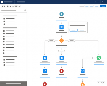
SLDS workflow builder
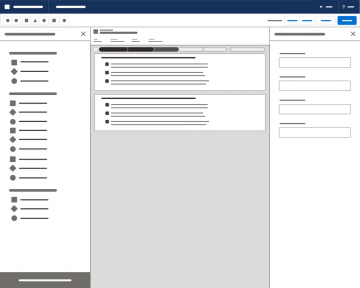
SLDS builder with overview panel
Technically, SLDS is tightly coupled with the CSS framework used to implement it. The guidelines basically are at the same time the documentation for the CSS framework. For those components, that cannot be implemented by CSS only (combos, tabs, data tables, etc), Salesforce provides open source Javascript implementations based on React. This "Design System React" is a typical component library with a large collection of loosely coupled controls.
Since the Lightning Design System generally visually resembles Bootstrap, third-party UI libraries with bootstrap themes should be easy to integrate. On the other hand, if you do not want to use SLDS directly, it's design guidelines are easily be adapted to any Bootstrap based UI framework. For example, the guide on building logical expressions for filters and conditions of all sorts is worth to follow in any enterprise UI.
Pros:
- One of the richest collections of enterprise-oriented controls
- Guidelines are easy to apply to any Bootstrap-like UI
- Destkop-first approach well suited for typical backend solutions
Cons:
- Few mobile or responsive components
- No charts or other data visualization
- Screen-layouts are schematic without real-world examples
Final toughts
As you can see, the three UX design systems in this articles are very diffent.
SAP builds a world of it's own with great ideas, some of the best guidelines, but quite special all-in-one frameworks SAPUI5 and OpenUI5 aiming at particulary small mobile-first apps. Still, SAP Fiori is the the top dog in the world of SAP products.
Microsoft still seems to be on it's way to a real design system: it's Fluent Design is quite impressive, but currently almost unused, while development tools and guidelines for Office and Dynamics products lack a common structure and even a continuos look&feel.
The Salesforce Lightning Design System, on the other hand, is probably the closest to the expectations of a typical enterprise web app developer - not only visually, but also from the point of view of architecture: it is very modular and not oppiniated about implementation details like single- or multi-page apps, routing and so forth.
Outlook
In the next article, I'm going to continue with Google's Material Design, IBM Carbon Design System and Oracle Alta UI with it's Javascript implementation Oracle JET.
